Transport for London Congestion Charge Redesign
Duration: 1 year | Role: Lead UX Designer | Link: tfl.gov.uk
Introduction
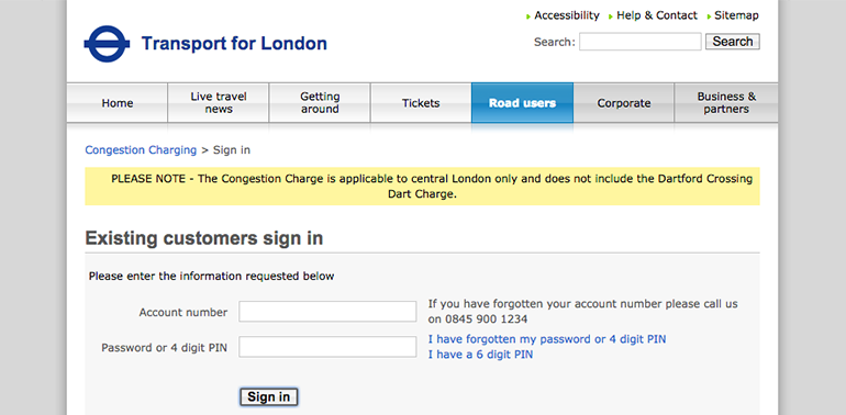
At the time of the project, the Transport for London website was over 8 years old. Since it’s last iteration, end user technology had evolved as well as user expectations. The whole site needed to be redesigned so that it worked responsively and better met the needs of those travelling around London.
My role at TfL was to be the lead UX design consultant for the redesigned Congestion Charge site, applying a user-centered design approach to the project.
The Problem
Working on the TfL redesign presented many challenges. The Congestion Charge project involved extremely tight project deadlines, multiple stakeholders, several external suppliers and a legacy system that was being quickly being phased out. As well implementing a UX design approach to this project, much of my work was to align expectations and to create a shared vision amongst the internal team.
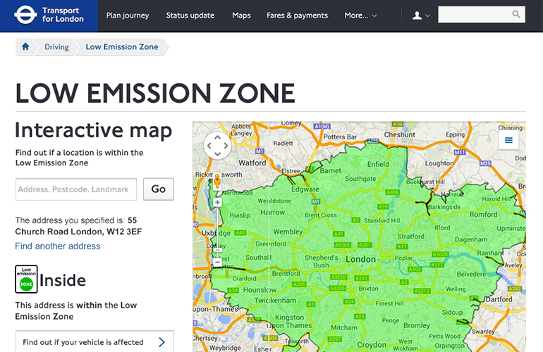
As millions of users were used to the existing site, it was important that the redesigned website did not become a barrier to those who depend on using the site to travel around London.
The Solution
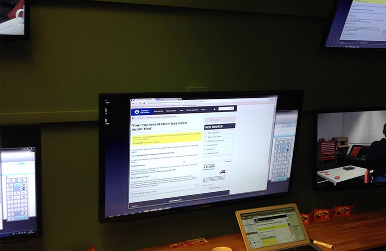
A complete redesign of their website to a new fully responsive design. It was vitally important to design better experiences for mobile usage as much of TfL’s traffic was moving from desktop to mobile.
Due to the short timescales involved, the project was broken down into 4 core sections that would break the work into manageable pieces. These 4 sections being split amongst several design and research teams. Adopting a “fail fast” approach, the project was set up so that there would be rounds of testing every 2 weeks. This meant that design ideas and key assumptions could be quickly validated before the team became too attached to any one design direction.
My Role
My role within the redesign project was as lead UX design consultant working alongside researchers, visual designers, UX designers, business analysts, technical architects, product owners and both front-end and back-end developers.
It was also my responsibility to be the main design point of contact for the internal stakeholders which often meant presenting designs, workshop facilitation and gathering business requirements for the team to work with.
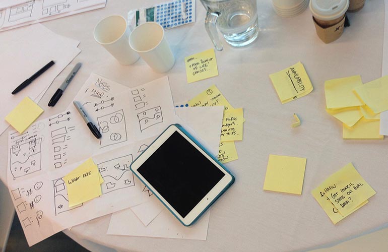
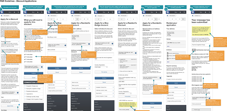
Starting Lo-Fi
Because many of the user journeys on the website can become very complex when dealing with so many variations, it was important to start with very high level concepts. This meant starting with low fidelity mock ups so that we could work out these complexity before committing to more detailed designs. This also allowed us to explore many differing approaches and assess the strengths / weaknesses of each.
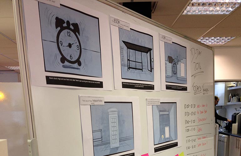
Storyboarding
To help communicate concepts, I created a series of storyboards that illustrated certain use cases. These storyboards helped to explain the context of use for each of the designed user flows and when they would be most applicable. This proved useful when dealing with stakeholders who didn’t come from a digital background but had a vested interest in the services we were designing.
It was also a useful artefact for the team to use as reminder of the direction of the project. This can often get lost when large design teams are working to compressed timelines and helps keep the designers remain focused on the end goal.
Working With Research
As the team adopted a ‘fail fast’ approach to the project, it was important to work very closely with the researchers on the team. Within each of the 4 parts of the project, research sessions were lined up in quick succession - quite often at a frequency of every 2 weeks. This allowed us to quickly work through our design assumptions and rapidly iterate on designs that had been created.
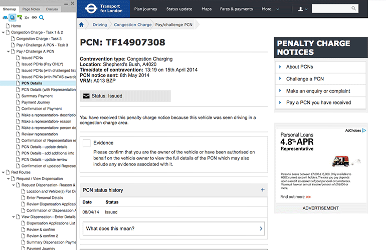
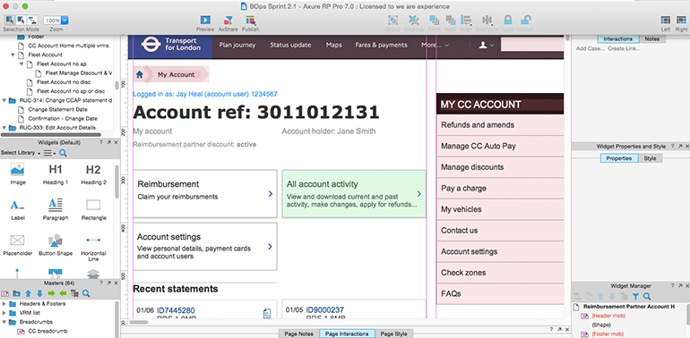
Shared Axure Prototype
As there was many features that needed to be implemented in order to successfully replace the legacy system, it was necessary to divide the work amongst several design and research teams. In order to aid consistency amongst these teams, we created a shared Axure prototype that allowed us to share our design patterns and styles.