Case Study - BBC iSite
Duration: 18 months | Role: Interaction Design / Researcher
Introduction
BBC iSite is one of the core CMS applications the BBC uses to power popular sites such as CBBC, CBeebies, Blogs, Programmes and Corporate. It is a central application that helps the BBC push great content to its 64 million unique users. The previous application was built on top of an Alfresco framework but within a few years it had quickly fell behind the needs of its extensive user base.
My Role - Interaction Designer
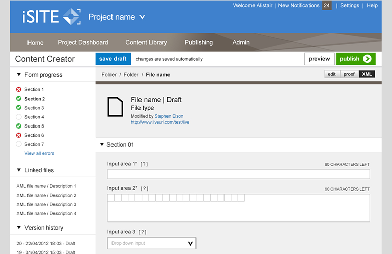
iSite Wireframe My role within the team as an Interaction / UX designer was to lead the UX strategy for the project, ensuring we deliver a far more user-centred product than the proceeding. Working with an information architect, visual designer, business analyst, project manager, product owner, tester and a large team of both front-end developers and software engineers, I worked very much the end-to-end process. End-to-end being from design research (with the IA) and core user journey mapping through to product iterations and product presentation. I successfully embedded a UX process into a fast paced Agile environment where was able to quickly iterate on ideas and assumptions based on short user validation / feedback loops. Within the project, I also devised usability testing programmes and scripts for usability experts to conduct as well as running some of these personally. These tests being conducted both on a one-to-one basis (guerilla) and within a purpose built usability lab. Part of the role required me to present directly with the project sponsors, to ensure that I was designing software suitable to their needs.
Understanding the Problem
When I joined the project, a fantastic information architect had already began his research into the uses of the software and had conducted dozens of one-to-one user interviews as well as user journey models. Working closely together, we was able to divide the users interviewed into a user-type, typified as user personas. From this I was able to gain a deeper understanding of the issues from a user’s point of view. Where there was gaps in the research, I was able to conduct further interviews – especially with some of the guys from Radio 1 and Radio 4 especially. It was clear to see that general usability issues (especially within the publishing and saving interactions) and poor user journeys to complete user goals.
Solution Ideation
Once we was able to have a deep understanding of the problems with the previous software solution and the user goals of the software’s extensive and varied user base, we was able to start thinking of solutions. Many of those on the team had some great ideas long before I joined the project. It was fantastic that anyone could generate UX ideas and was not isolated to the UX&D personnel. My only reservation was that some of these ideas had been generated by spending a long time close the problem (i.e. the software), maybe a fresh perspective would help. Because of the great collaborative space we had been able to create through a shared understanding of the problems, we were able to implement some of the methods from Lean UX. We treated each idea as an assumption of the solution and used various methods in which to validate these assumptions and ideas – most notably through the use of prototypes. Some of these solutions included a WYSIWYG feature (very costly to produce) and an elaborate folder structure system. Whatever solution we adopted we needed to be 100% sure this was the most appropriate as many of our colleagues will have to live with these as part of their working lives from a long time – big pressure.

Prototype
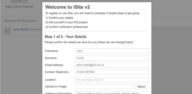
We prototyped early and often, which worked really well for us. As soon as a great idea have been generated, we tested these in context the use case of that solution. This allowed us to understand the validity of the solution against the potential cost in time and resources. Having a wide range of skills within the wider team, we was able to prototype on everything to hand – PostIts, paper wireframes, clickable PDFs, competitor applications and HTML prototypes.
Usability Testing
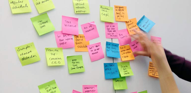
To say we tested a lot would be an understatement. On top of the informal idea validation sessions we ran on PostIts, paper wireframes and PDFs, we run 68 usability tests from everything from HTML prototypes to actual real code. To test little but often has many advantages, but most notably it allows us to validate early and iterate on that design without the natural emotional attachment once you have dedicated a lot of time to that solution. Leading all the testing programmes with a handful of other testers, we had a wide range of testing types from guerrilla one-to-one sessions to lab based sessions. Within the lab we had the great benefit of allowing the wider team see the results of these tests for themselves. Once we had completed each round of testing, the report was generated from a collaborative workshop where we highlighted everything we saw individually on PostIts (we got through a lot of these) and clustered these into themes within a card sorting session. We was then able to talk through these themes and again collaborative agree on the results to be added to the lightweight report.

Working With Agile / Lean UX
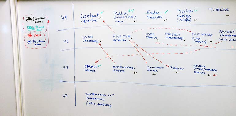
The benefit on working Lean within the project was that this fitted in really well within the high pressure and high tempo Agile environment. Deliverables only generated at the point of the process pull and was usually lightweight. All of this combined allowed us to be truly iterative. While delivering the input the team needed at the point of each sprint / release, I maintained my own Sprint 0 wireframe set. Maintaining this additional set of wireframes away from those that related to the up-and-coming sprint allowed us to maintain the longer vision for the product. Although initially seen as a ‘Waterfall’ approach, this eventually became a saviour at multiple pain point in the development process. Although extra work to maintain and refresh every time we learnt something new by looking at it a greater detail, it also allowed us to understand how all these components would eventually fit together. Had we not had these, very often we would of picked a solution that would not be compostable further down the development process – an inevitable evil to the otherwise superior Agile framework.

Everyone Can Be A Designer Of Solution
As a passionate UXer, I was keen to embed an environment where anyone could be a designer of solutions. I strongly feel that the mentality of UXers are the only people who can generate great ideas are extremely dated and generally unhelpful to the wider environment. Where we had a gained shared knowledge of the problems, collaboratively generated ideas and all had visibility of the testing and validation all of these I was keen for the team to be able to function as effectively in my absence then when I was available. Often I was pulled into other projects and spent time on holiday and paternity, it was important the team had the mindset to gain an understanding of any new issues, generate ideas, validate and iterate. This was also a massive benefit even when I was on the team as some of the more standard issues could be overcome independently allowing me to work on the more pressing issues that team was facing.
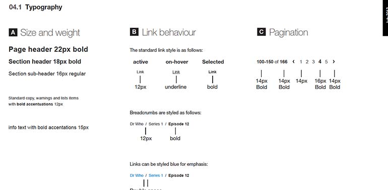
Styleguides
Working very closely to an ultra talented visual designer we was able to reach a very simple and clean user interface. Our shared vision was that if users would be spending most of their working days using the software, we should go for a design that is elegant in its simplicity and would only expose more complex patterns if an interaction would suggest this could be useful (such as settings from last visit). My wireframes in general was very detailed due to the fact we had worked so closely on the end UI design, but also was necessary due to the testing we had been running on paper and PDF prototypes. As part of the vision to allow the team to be self sufficient on most issues that may come up, we had come up with a detailed interaction and visual styleguide. As we moved through the development process, we moved this to a collaborative Wiki space where anyone could make amendments. If a developer had to change the style of any feature for any reason, they could make changes themselves and update styleguides. Had this gone back through UX and visual design everytime we would quickly become the bottleneck of the process. We also worked on an online styleguide where we would on a design component then pair with a developer to add these to a living code styleguide. Thus shortening the design to code time but most notably breeding code standards and the ability to quickly grab components to be reused over and over again.
Presentation
Very often, I was called on to present ideas to users, the production team, project sponsors and some very senior BBC staff. The contents of these presentations varied from explaining a simple component to explaining the UX strategy I had adopted for this very expensive and high profile project. Quite often I had to deal with some very angry users of the previous Alfresco version and to try relax any anxiety of the new version. Other times I had to explain detail and logics of a feature to engineers and developers, who by nature, are very analytical and require highly detailed, highly robust descriptions.